Art Progression and Comparison

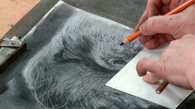
It started off as the usual pet portrait commission of a cat named Teacup. The same buyer then asked me for another, and another. That's three in total, in the same medium and with the same reference. I pondered the sequential requests that night and weighed my thoughts out. Aside to a nagging belief that drawing the same thing is boring and (besides) I can’t draw the same thing twice, there were all pros to do it. It was a challenge, more money, a nice patron who was sending other commission requests my way, but most of all - Teacup was old and sick. I so respect that she wanted original drawings, when she could have just scanned and made prints of the first one … obviously this cat means as much to her, as my cats mean to me.

So now that I have rendered 3 x Teacups, I can’t help but be curious of the similarities and differences.

Teacup comparison

Teacup comparison

I love the first one - it’s a loose and expressive style with a lot of raw energy. I referenced a b&w photocopy, and went at it with my usual process - all over charcoal powder and lots of eraser removal to reveal form.

The second portrait happened during a shift in my art journey where I was bored with charcoal and my process, and intended to push myself. So I approached the middle one differently, using selective charcoal powder and carbon pencil instead of charcoal pencil. The whites were a lot crisper and cleaner because of that, as well the carbon pencil is much harder than charcoal, so the mid values were better and the overall was much softer (I did use compressed charcoal when I wanted a darker value than 6B carbon). The form is better as I caught little things from looking at the first one i.e.. the proportion of the eye and the definition between face and body on the right side. I referenced the colour photo at the end, which led to a greater understanding of the form thus some adjustment and recovery. I realize now that details do get lost when you convert a photo to black and white. I used to convert the reference to monochromatic to help me and avoid distraction of the colour - but that doesn’t serve me anymore.

Reference Photo of Teacup

Reference Photo of Teacup

With the third one, I was much more familiar with the subject, and focused more on form, depth and value. More focus on the subtle details (cheek, whisker follicles), angle of the face, depth of the body, variations in the fur. I was thinking even more clearly about technique and process that started to develop with the second, so there was still some trail and error but all in all it seemed like a natural progression. I referenced the colour photo more throughout, using my own judgement and understanding of the values, and found this works better for me now. The carbon line work is minimal yet still sculptural. Not sure why but it seems I achieved more with less!

When I compare all three to the original photo reference now, it’s interesting that no matter the process and markmaking, capturing likeness and personality is achievable if you get the proportions right. There are aspects in each of them that I like, yet feel I learned the most in the second portrait. Until now, I preferred a more intuitive approach, that planning interferes with spontaneous energy of a work. It can, but I certainly see the value in working past that. Perhaps this experience will bring me closer to developing some conceptual abilities as I would really like to explore creating beyond my observational skills. It would be nice to break new ground! Thanks Teacup xoxo

Krylon Spray Cans All Look The Same ...

Let me start by saying this is a very embarrassing lesson, but all the more reason I must pass it on ...

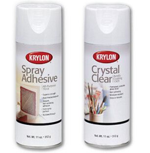
This is the second drawing I have created from the same reference. I'd like to post later about drawing the same subject (as I will be drawing a third) and the comparison factor, but this is about the end of this one!After finishing this charcoal drawing (of which I was very proud!) I went to fix it with a finish.I use Krylon Spray - Crystal Clear for all drawings and mixed media work.Problem is ... I didn't grab the right can! I grabbed a SPRAY ADHESIVE. I only realized this when I went to scan it, and the surface of my drawing glued itself to the scanner glass surface. omg - HUGE sad face :(Now I wasn't rushed, drunk or high. Of course, I must admit distraction (my mind is preoccupied with its own insanity!).  I was obviously not thinking clearly or being attentive. Yes, I can read! ♥. But this was not just 'one of those stupid things' .... I think back and realize I only recently purchased Krylon's Spray Adhesive for the first time last Fall. Prior, I always purchased 3M Spray Adhesive which is a black can and looks very different, and what I am used to seeing.

I rely on my visual senses and comfortability in my studio space SO MUCH that I abandoned all my other senses! That comfortability then lead to abandoned reason, because I know to TEST first on a scrap piece of paper, especially before layering on a final work. ESPECIALLY a final work you LIKE!

Mixed Media includes adding a finish to a drawing. When you introduce a new product, you should TEST first. I even have experience to support the knowledge to test what you know, as once a can of the right product 'Krylon Crystal Clear' (which was OLD) turned a mixed media tree piece completely white - almost as if I used a can of fake snow to spray on it. With a lot of research, I discovered that when they say to SHAKE THE CAN you really should listen. Those couple of boring minutes shaking a can is good advice. To my demise, the contents of that old can had separated, and I may have avoided destroying a work of art had I been more ATTENTIVE (to instructions as well as how old that product was). I now write dates on all products and storage bins.  Now, how did I fix this big 'OOPS!'...

TeaCup Commission - Charcoal on Paper 9"x12"

TeaCup Commission - Charcoal on Paper 9"x12"

I thankfully only sprayed a 'dusting' ... even if you are using the right product, it is always better to build up in many light layers that one globulous coat. A heavy sprayed coating can saturate and damage the work. Light, dusting layers allows CONTROL over everything.

  • After realizing what had happened, I sprayed many layers of the Crystal Clear over the drawing. Each layer coated the spray glue, as well as the charcoal. *relief!* The drawing is just fine!

  • Immediately, I cleaned the scanner surface with diluted ammonia and water (you can use whatever you like to clean glass). I sprayed a dry cloth so the cleaning solution was not all over the equipment, and it removed easily.

  • Intentionally marked the cans DIFFERENTLY. The Spray Adhesive can now has a big black strip of black duct tape on it, as well I've put it in the 'adhesives' tupperware bin, which I had not bothered to do before.

This is a reminder for us all to TEST first. Test often, and test more than you think you need - especially when introducing new materials/mixed media. It may be annoying, but best to test and know it's all good than have to freak out and recover! Many manufacturers note a disclaimer on this! We can't ask these companies to have distinct and visual labels, nor assure us positive results considering their 'general purpose' (even for specific purposes, there are too many variables once out in the marketplace and in the hands of individuals). Personally, I know this well - yet I keep learning this lesson from time to time the hard way. So I will continue to pass it on. My only saving grace is that I do accept my mistakes and know it is my fault and responsibility if anything terrible goes down in this creative space.

Mixed Media 'Curse'

Next to the taunting torment of ‘the muse’ who looms with an array of ideas that must be sifted and sorted, it’s choosing a medium that haunts me the most. Sometimes being a mixed media artist is both a blessing and a curse - I am always torn by the multitude of medium possibilities!

  • A stack of mirrors sit in my studio awaiting experimentation with acrylic glazes.
  • Winter 2014 was all about Pan Pastels to prepare for Craftsy class #2. I'm still learning about and loving them.
  • On a recent plein air adventure, I revisited my love of oil paints and the delight of painting outdoors ... even in the middle of snow storm! 
  • A trip to the Art Store reveals a slew of new art supplies just released (and I dislike feeling I’m out of touch with the art material world!); I walk out broke, and although inspired with an array of new toys - all the fresh new materials sit around for some time collecting dust until I have time to play. I splurged on a rainbow of pastel pencils months ago, and I have yet to put them to use!

Ideally, one should have more material than one can possibly cope with. ~Frank AuerbachSurrounding myself with materials and surfaces is a huge source of inspiration (I love materials!) yet it can be conflicting living in the midst of it all, waiting until the right idea is a match for it. *sigh* No doubt, this madness is perhaps genius! I can’t say I intend to change my ways, or could, even if I wanted to! With a passion to experiment and honour any idea with the medium that may be its best voice of expression, I have accepted this conundrum - even if it means that my work may rarely have a visual continuity, especially since medium sometimes influences style. I also know that not everything I do will see the light of day anyway. Playing is liberating! Experimentation is educational! So in this time of being overwhelmed by 'all the possibilities', I calmly remind myself that 'all those possibilities' are waiting for me whenever the muse visits, and in the meantime I find clarity and peace in their midst.Take materials that represent you best and go for it! ~Schar Chappell

PET PORTRAIT COMMISSIONS

I've been having a fabulous time drawing a lot of pet portraits since moving to The Beaches. Everyone has a dog here (even the cat lovers!) so now I know I will never, ever tire of drawing these incredible creatures! Commissioning a pet portrait can be personal, or a gift - and the time is now! Christmas is coming up, and since I'm ahead of schedule, I am inviting some more orders. Win-Win! 

Animal Portraits 
Charcoal Drawing

A classic, artist expression of your beloved dogs, cats, birds, exotic creatures.

  • Signed charcoal drawing on quality paper

  • Standard size is 9"x12" unframed (you can frame in a standard 8"x10") - other sizes available

  • Satisfaction guaranteed!

Latest Pet Portrait Commissions

Latest Pet Portrait Commissions

Check out my website for more details. Email sharlenawood@gmail.com with your favourite photo of your adorables face for a reference to get started. Make sure it's clear and not effected, so I can see the detail and capture all the special markings and likeness!