Fall & Winter Workshops 2016

Upcoming awesomeness!

VISUAL ARTS MISSISSAUGA

Art FUNdamentals •10 wks WEDNESDAY EVENINGS  Oct 5, 2016 - Dec 7, 2016 Time: 5:00 PM -6:30 PM, Level: Ages 8-9 *Link to register

Art FUNdamentals at VAM is a fun and progressive course comprised of over 600 lessons making up a 7 year program. Children never repeat the same lesson twice! Working at their own pace, students are encouraged to slow down and watch their imaginations speed up while developing and practicing new skills. Students work in small peer groups and investigate drawing, painting, sculpting, printmaking and much more while connecting the dots through art history, the principles of art and design and art practices from around the globe.

Teen Portfolio Prep-Secondary School•11 wks WEDNESDAY EVENINGS Oct 5 2016 - Dec 14, 2016 Time: 7:00 PM - 9:00 PM, Level: Grade 11+ *Link to register

Specialized courses designed for students who plan to apply to a visual arts program at the secondary or post-secondary level. Along with the opportunity to develop new portfolio pieces, students will be coached on presentation, critique and interview skills. Each student will participate in a private mock-interview and portfolio critique. Currently in Grade 8 and applying for Fall 2017 entry to Secondary School Visual Arts Programs. Emphasis is on preparing portfolio-ready work that meets the requirements of regional arts program in Peel District, Dufferin Peel Catholic District and Toronto District School Boards. Materials included. Students should bring a sketchbook and expect some weekly homework.

Breaking_web

Breaking_web

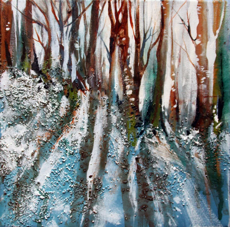
Acrylic Confidence - The Bold Basics • WorkshopPart 1- 5 weeks, THURSDAY MORNINGS October 6 to November 3, 9 am to 12 pm *Link to registerPart 2 - 5 weeks, THURSDAY MORNINGS November 10 to December 8th, 9 am to 12 pm *Link to register

Discover the essential techniques you need to paint confidently with acrylics! Understand the technical properties of acrylic paints and mediums, fundamental design, colour and value, and how the right tools and tips all work together to help you achieve astonishing results. Key techniques will explore traditional and experimental approaches to painting with this forgiving, versatile medium, giving you a new understanding of the myriad ways you can use acrylics to create anything that catches your imagination. Benefit from demonstrations, advice and personal guidance for beautifully completed paintings that combine knowledge and skill with the joy of painting!

creative-cards-sample-web

creative-cards-sample-web

Creative CardsSaturday December 10th 2016 - 9am-4pm

Get ready for the holiday season! Express creativity, joy & gratitude while continuing to improve your painting skills and learning a variety of interesting techniques to expand your ability to create with mixed media. Using acrylics, drawing tools, and collage elements in combination with tips for stylish presentation, this festive card designing workshop welcomes all ages and all levels of experience, inspiring a wide variety of ideas for making your greetings this year extra special.

My favorite art materials!

A reference for artists taking Painting Wildlife: Acrylic Mixed Media and Drawing Wild Animals on Craftsy.com

Art Progression and Comparison

It started off as the usual pet portrait commission of a cat named Teacup. The same buyer then asked me for another, and another. That's three in total, in the same medium and with the same reference. I pondered the sequential requests that night and weighed my thoughts out. Aside to a nagging belief that drawing the same thing is boring and (besides) I can’t draw the same thing twice, there were all pros to do it. It was a challenge, more money, a nice patron who was sending other commission requests my way, but most of all - Teacup was old and sick. I so respect that she wanted original drawings, when she could have just scanned and made prints of the first one … obviously this cat means as much to her, as my cats mean to me.

So now that I have rendered 3 x Teacups, I can’t help but be curious of the similarities and differences.

Teacup comparison

Teacup comparison

I love the first one - it’s a loose and expressive style with a lot of raw energy. I referenced a b&w photocopy, and went at it with my usual process - all over charcoal powder and lots of eraser removal to reveal form.

The second portrait happened during a shift in my art journey where I was bored with charcoal and my process, and intended to push myself. So I approached the middle one differently, using selective charcoal powder and carbon pencil instead of charcoal pencil. The whites were a lot crisper and cleaner because of that, as well the carbon pencil is much harder than charcoal, so the mid values were better and the overall was much softer (I did use compressed charcoal when I wanted a darker value than 6B carbon). The form is better as I caught little things from looking at the first one i.e.. the proportion of the eye and the definition between face and body on the right side. I referenced the colour photo at the end, which led to a greater understanding of the form thus some adjustment and recovery. I realize now that details do get lost when you convert a photo to black and white. I used to convert the reference to monochromatic to help me and avoid distraction of the colour - but that doesn’t serve me anymore.

Reference Photo of Teacup

Reference Photo of Teacup

With the third one, I was much more familiar with the subject, and focused more on form, depth and value. More focus on the subtle details (cheek, whisker follicles), angle of the face, depth of the body, variations in the fur. I was thinking even more clearly about technique and process that started to develop with the second, so there was still some trail and error but all in all it seemed like a natural progression. I referenced the colour photo more throughout, using my own judgement and understanding of the values, and found this works better for me now. The carbon line work is minimal yet still sculptural. Not sure why but it seems I achieved more with less!

When I compare all three to the original photo reference now, it’s interesting that no matter the process and markmaking, capturing likeness and personality is achievable if you get the proportions right. There are aspects in each of them that I like, yet feel I learned the most in the second portrait. Until now, I preferred a more intuitive approach, that planning interferes with spontaneous energy of a work. It can, but I certainly see the value in working past that. Perhaps this experience will bring me closer to developing some conceptual abilities as I would really like to explore creating beyond my observational skills. It would be nice to break new ground! Thanks Teacup xoxo