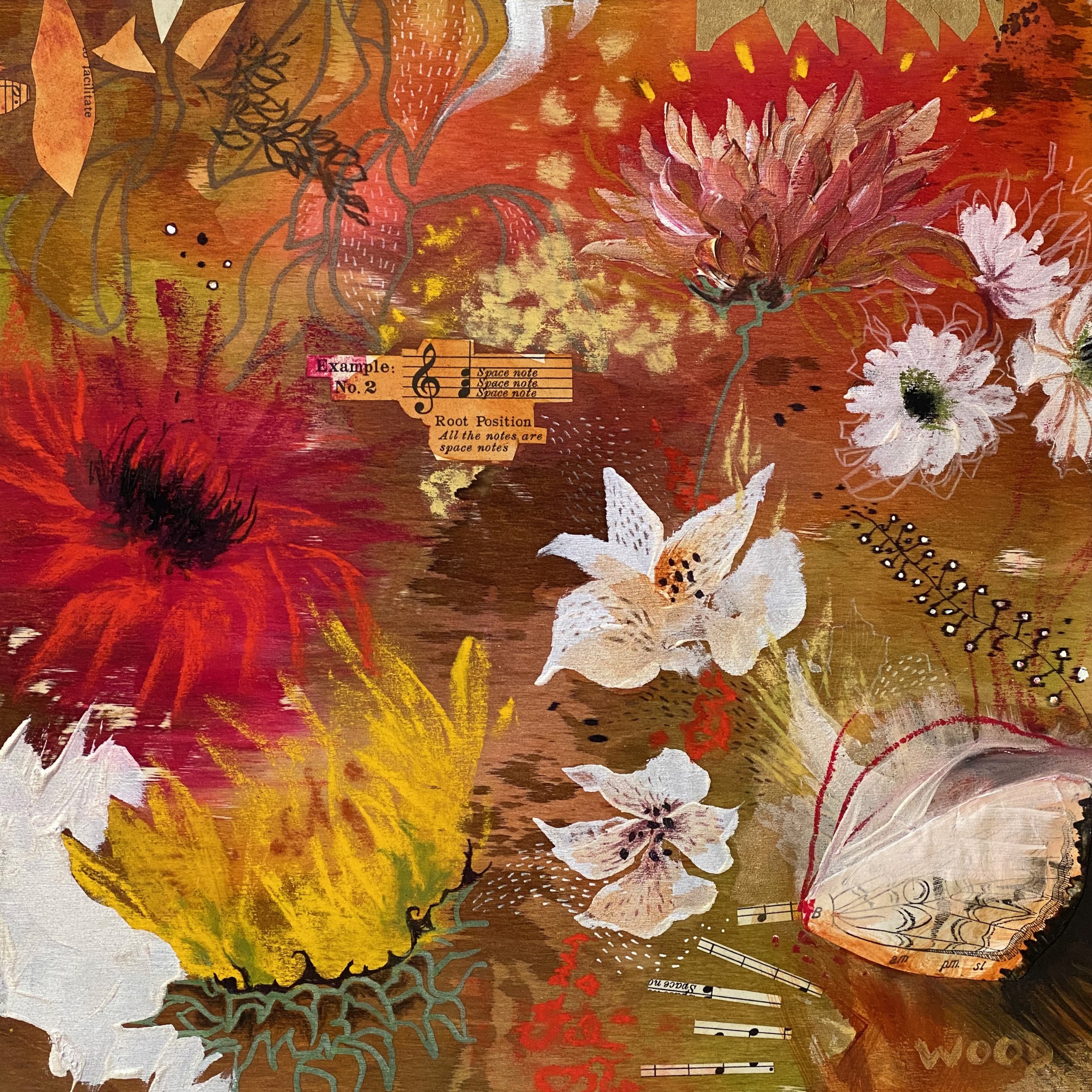
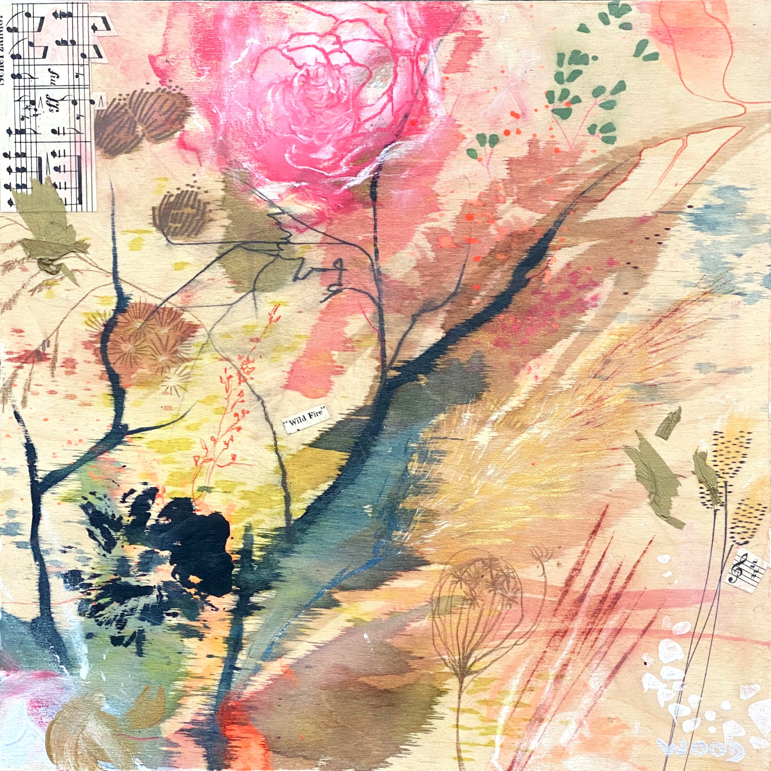
Final Drawing Project of 2023

While on my final art retreat of 2023, I started an idea of mandala tree rings - 44 rings for 44 years old.

I had no idea if I would even like this idea, but I prepared for it anyway when I packed to stay at up north at my friend’s remote home for two weeks. I thought I’d at least try it, and if I didn’t enjoy it, then I would still have plenty of trees to draw!

Some thoughts as I created:

- Washi paper is alive. It guides me, must go with the flow. It’s an Organic flow, working in tandem with the medium, tools, and surface.

- I have control over the design as I go Yet I cannot predict a line that is magic vs. an oops (then making the oops magical). Sometimes it feels as though my hand is being guided divinely.

-Memory … starting to think back over each year of my life, what stands out from what i can remember, with fondness remembering so much.

-The first 5 years are quick and too easy… rings get more difficult and longer around 25-30 (such as life!)

-Natural in consistency: inconsistency. The pressure I use starts light, gets heavier, and stressed as I get into my late 30’s -40!!! Realizing this in the second piece, so intentionally softened my grip in the last few rings. I’m sure there is a connection to life in that awareness!

-As per the last note, paint was far more controlled and ‘finer’ than drawing!!

-SLOWING DOWN. I feel Peaceful. Present. Intentional. Patient. Interacting with the medium, myself.

-I enjoyed the process, and want to create one that is very disrupted with cracks in the spirit of real wood and one with more expressive design elements in the spirit of a mandala. I have some ideas for more where each represents something specific about my life so far: relationships, hair colours, addictions/mental health/therapy… I have 8 more months to explore this meditation, which may turn out to be a series, but truly, it’s just for me xx

Art Progression and Comparison

It started off as the usual pet portrait commission of a cat named Teacup. The same buyer then asked me for another, and another. That's three in total, in the same medium and with the same reference. I pondered the sequential requests that night and weighed my thoughts out. Aside to a nagging belief that drawing the same thing is boring and (besides) I can’t draw the same thing twice, there were all pros to do it. It was a challenge, more money, a nice patron who was sending other commission requests my way, but most of all - Teacup was old and sick. I so respect that she wanted original drawings, when she could have just scanned and made prints of the first one … obviously this cat means as much to her, as my cats mean to me.

So now that I have rendered 3 x Teacups, I can’t help but be curious of the similarities and differences.

Teacup comparison

Teacup comparison

I love the first one - it’s a loose and expressive style with a lot of raw energy. I referenced a b&w photocopy, and went at it with my usual process - all over charcoal powder and lots of eraser removal to reveal form.

The second portrait happened during a shift in my art journey where I was bored with charcoal and my process, and intended to push myself. So I approached the middle one differently, using selective charcoal powder and carbon pencil instead of charcoal pencil. The whites were a lot crisper and cleaner because of that, as well the carbon pencil is much harder than charcoal, so the mid values were better and the overall was much softer (I did use compressed charcoal when I wanted a darker value than 6B carbon). The form is better as I caught little things from looking at the first one i.e.. the proportion of the eye and the definition between face and body on the right side. I referenced the colour photo at the end, which led to a greater understanding of the form thus some adjustment and recovery. I realize now that details do get lost when you convert a photo to black and white. I used to convert the reference to monochromatic to help me and avoid distraction of the colour - but that doesn’t serve me anymore.

Reference Photo of Teacup

Reference Photo of Teacup

With the third one, I was much more familiar with the subject, and focused more on form, depth and value. More focus on the subtle details (cheek, whisker follicles), angle of the face, depth of the body, variations in the fur. I was thinking even more clearly about technique and process that started to develop with the second, so there was still some trail and error but all in all it seemed like a natural progression. I referenced the colour photo more throughout, using my own judgement and understanding of the values, and found this works better for me now. The carbon line work is minimal yet still sculptural. Not sure why but it seems I achieved more with less!

When I compare all three to the original photo reference now, it’s interesting that no matter the process and markmaking, capturing likeness and personality is achievable if you get the proportions right. There are aspects in each of them that I like, yet feel I learned the most in the second portrait. Until now, I preferred a more intuitive approach, that planning interferes with spontaneous energy of a work. It can, but I certainly see the value in working past that. Perhaps this experience will bring me closer to developing some conceptual abilities as I would really like to explore creating beyond my observational skills. It would be nice to break new ground! Thanks Teacup xoxo

PET PORTRAIT COMMISSIONS

I've been having a fabulous time drawing a lot of pet portraits since moving to The Beaches. Everyone has a dog here (even the cat lovers!) so now I know I will never, ever tire of drawing these incredible creatures! Commissioning a pet portrait can be personal, or a gift - and the time is now! Christmas is coming up, and since I'm ahead of schedule, I am inviting some more orders. Win-Win! 

Animal Portraits 
Charcoal Drawing

A classic, artist expression of your beloved dogs, cats, birds, exotic creatures.

  • Signed charcoal drawing on quality paper

  • Standard size is 9"x12" unframed (you can frame in a standard 8"x10") - other sizes available

  • Satisfaction guaranteed!

Latest Pet Portrait Commissions

Latest Pet Portrait Commissions

Check out my website for more details. Email sharlenawood@gmail.com with your favourite photo of your adorables face for a reference to get started. Make sure it's clear and not effected, so I can see the detail and capture all the special markings and likeness!