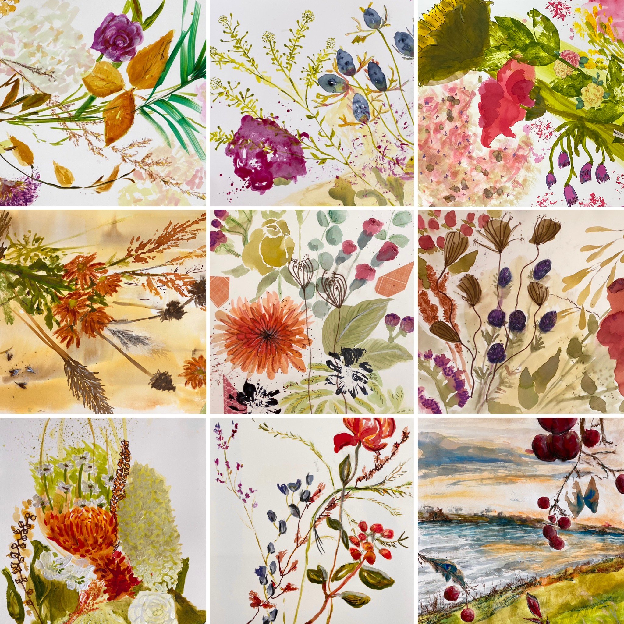
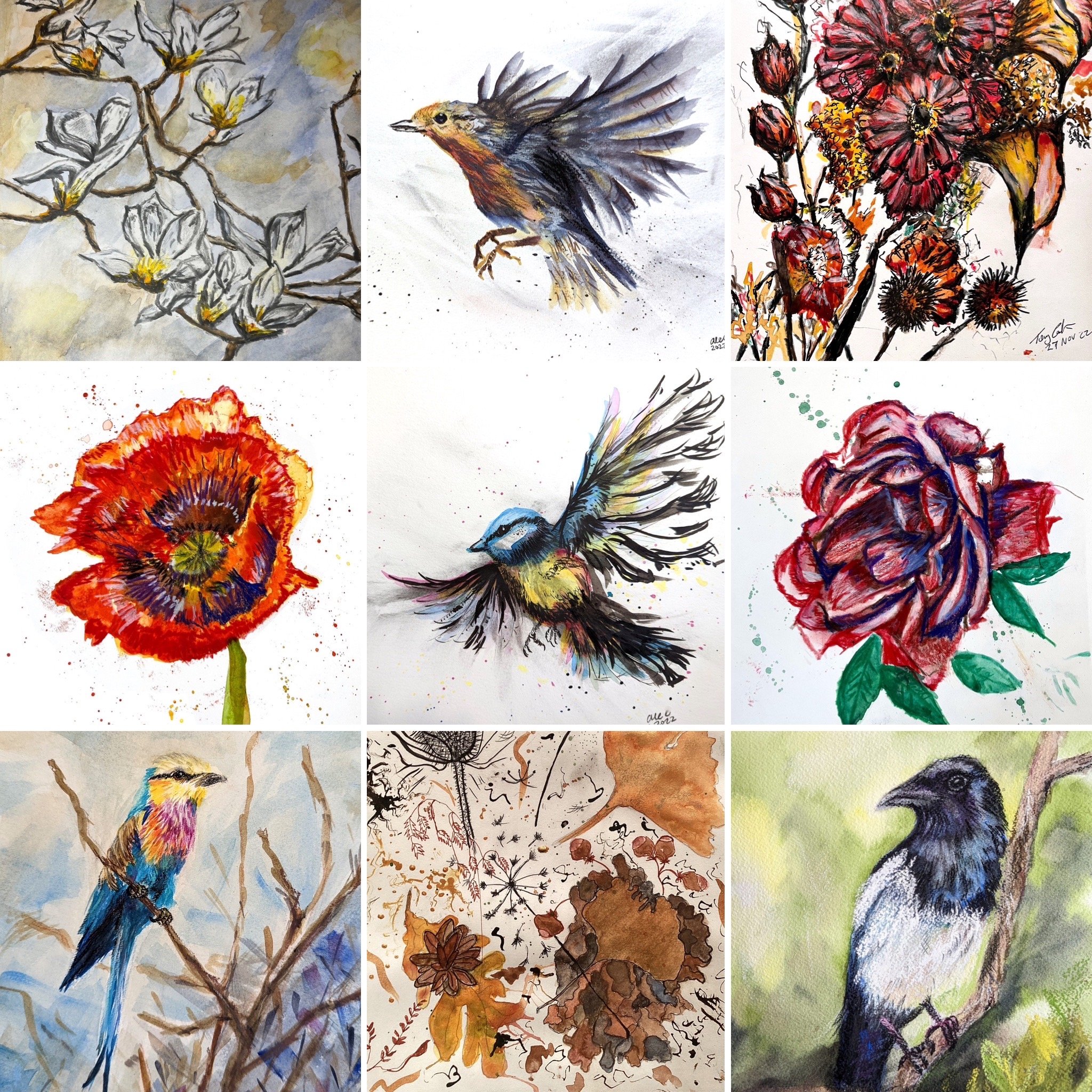
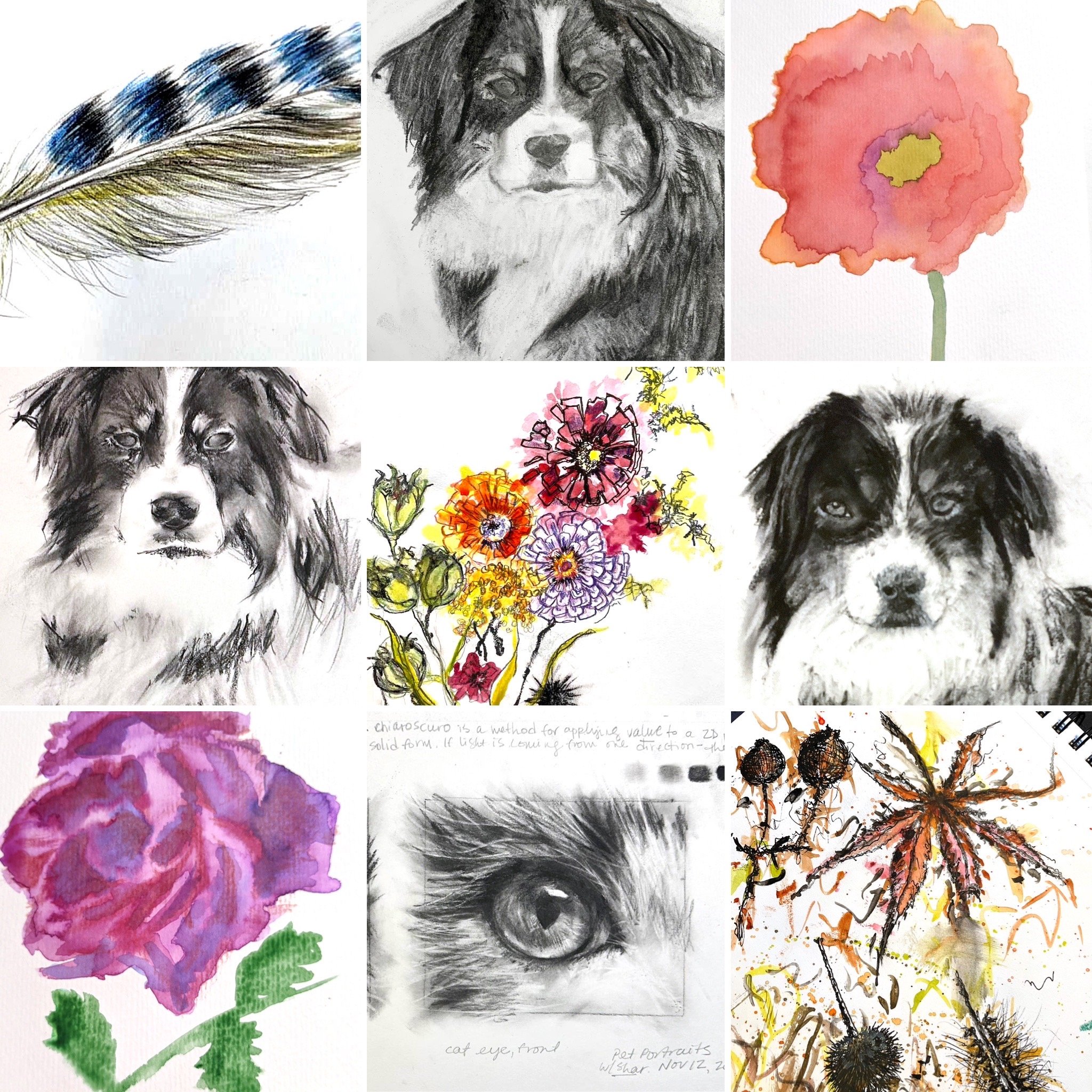
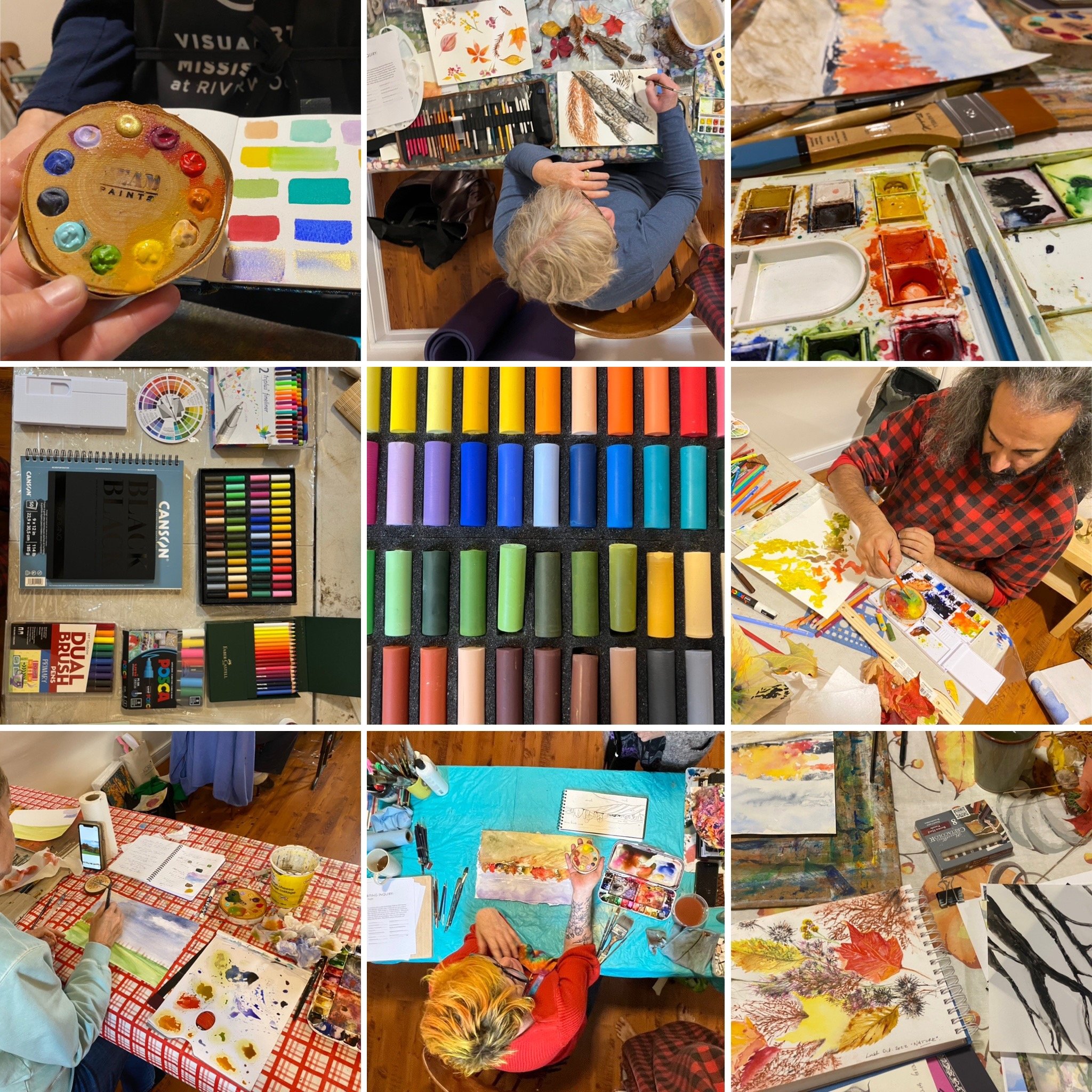
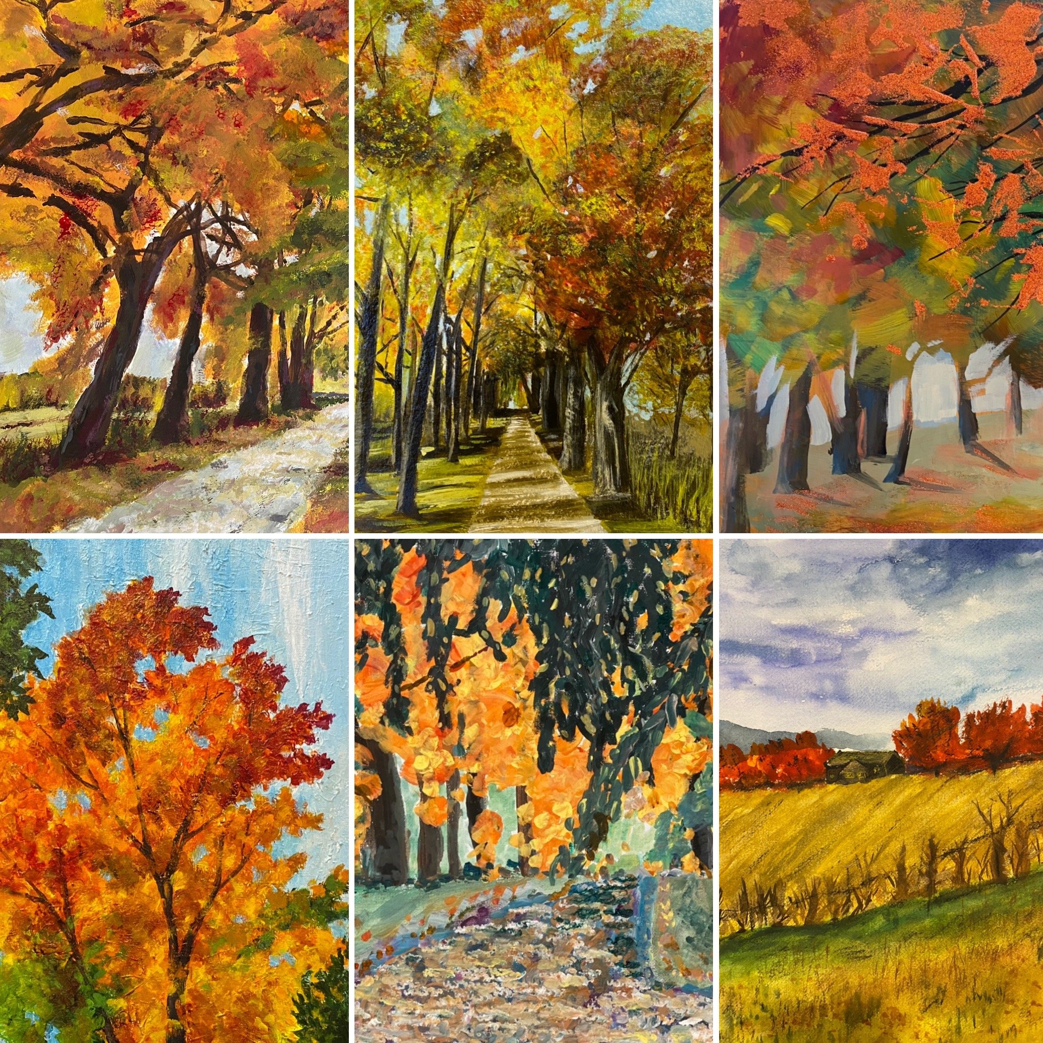
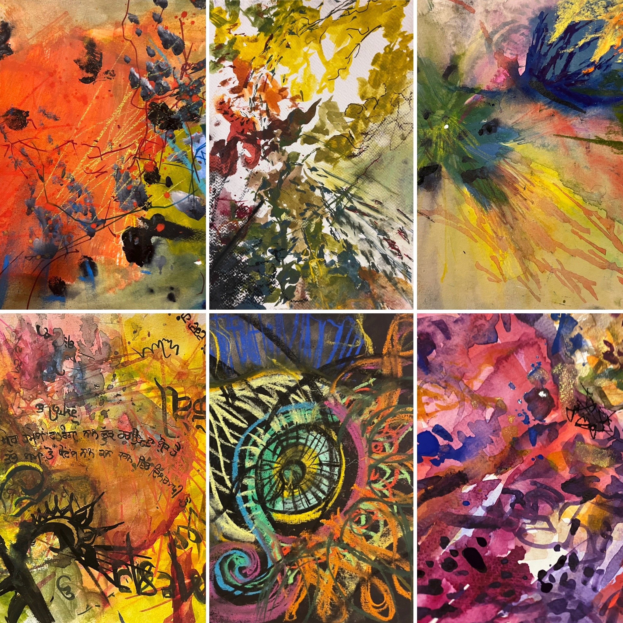
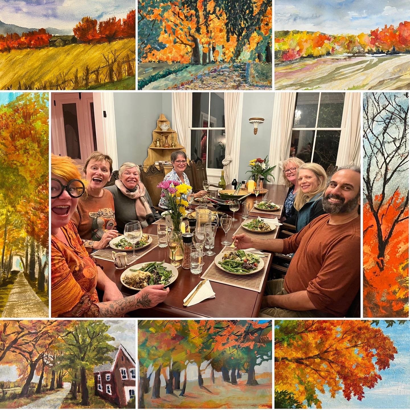
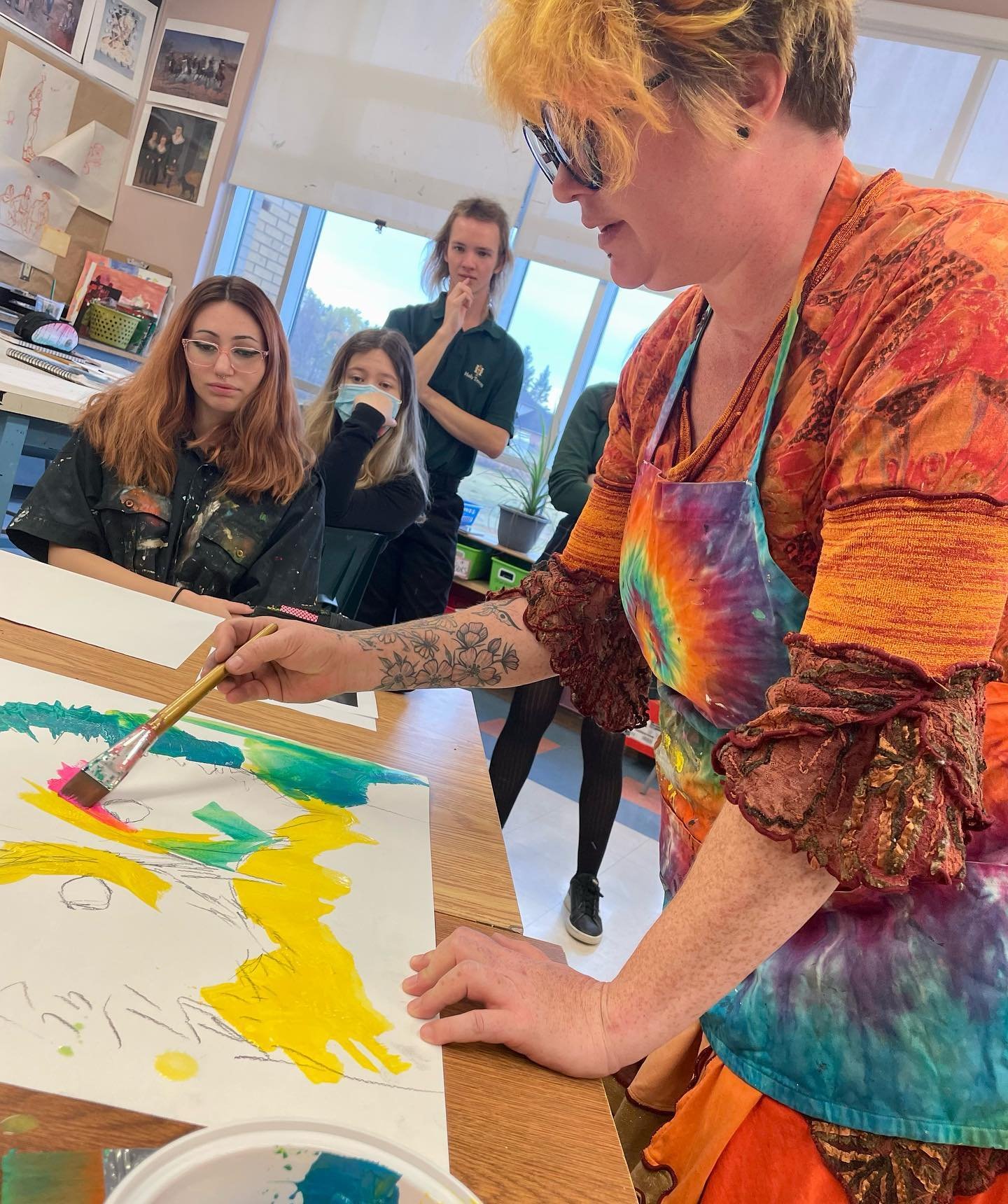
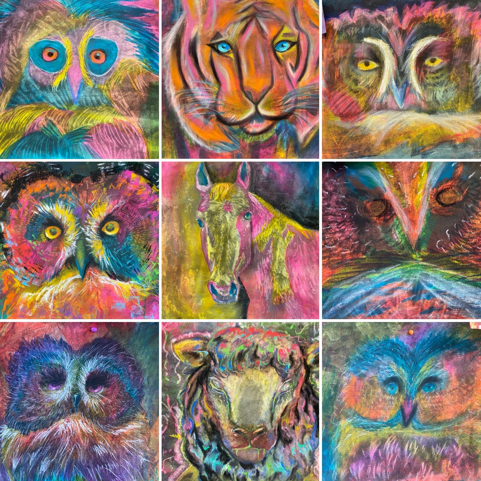
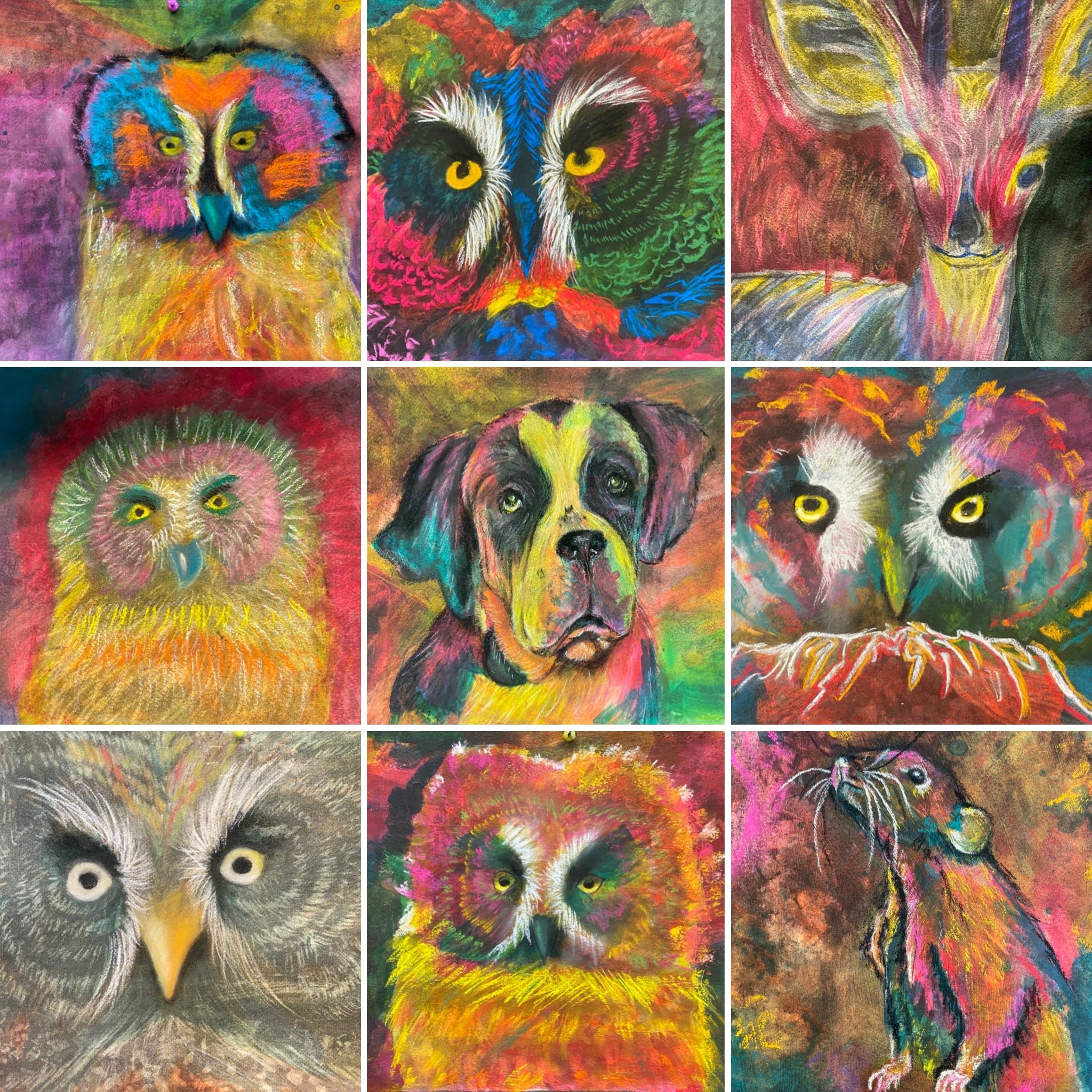
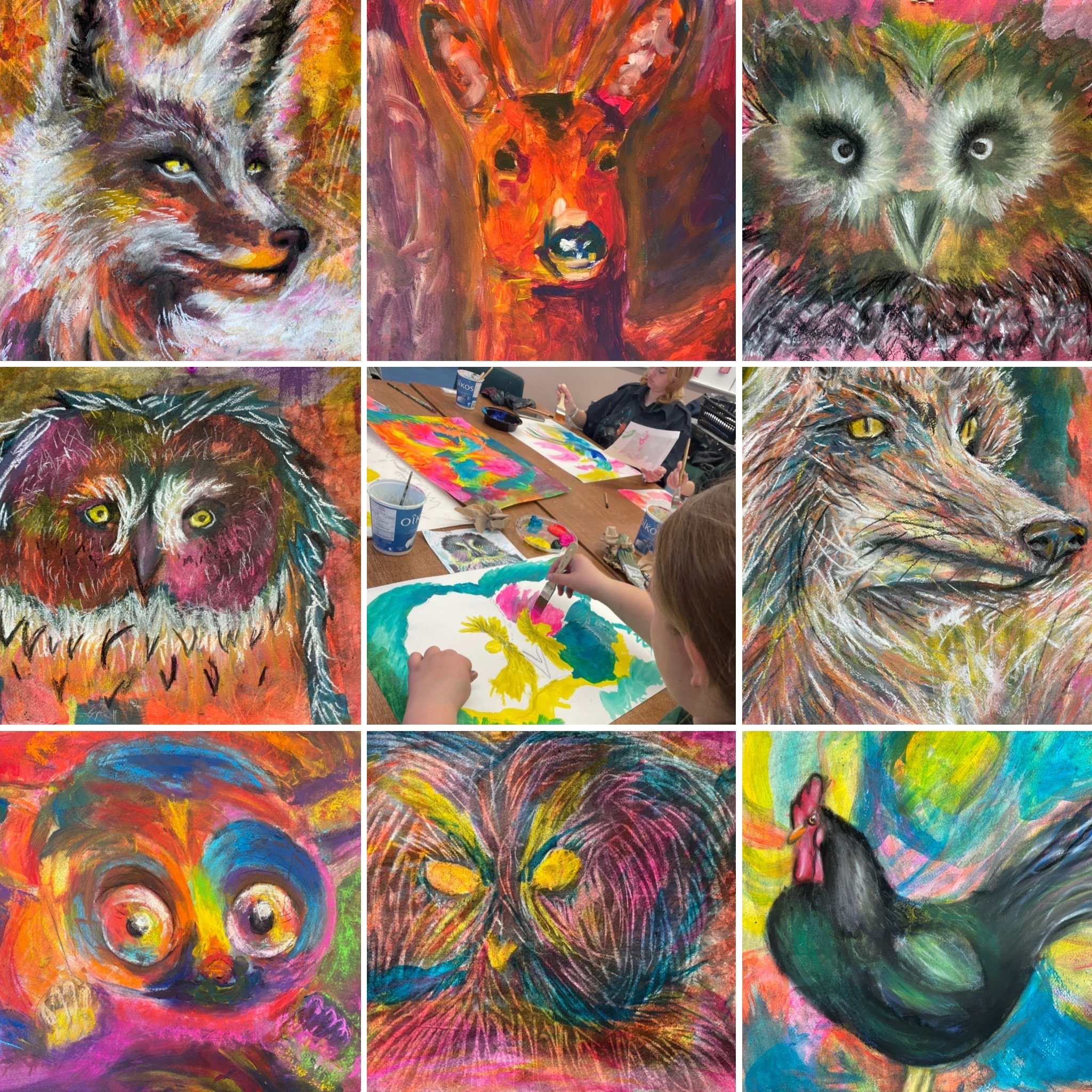
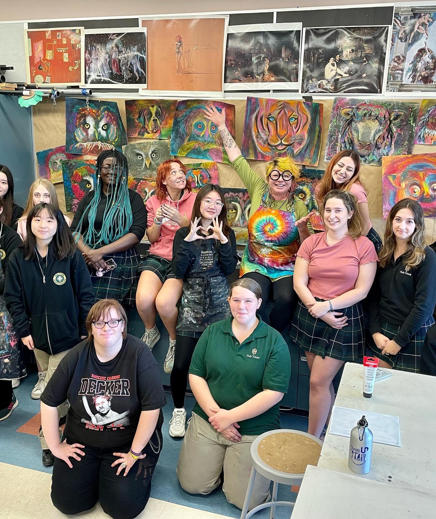
Teaching these past months has lifted my spirits with such wonderous creating, conversations, connections, and growth! I feel very blessed to share some of these joyous moments of inspiring student artwork and memories with you. From Lush Earth Oasis Retreat, to Clinehouse Studios, Holy Trinity High School and Zoom classes! Keep up the great work, showing up for yourself in creativity and community. xx
Happy Winter • Stay safe in your cozy nests, and please stay in touch. I welcome you to join my Facebook art group for co-inspiration and look forward to seeing what you create this season with the possibility of creating with you in the New Year 2023!
Editing Photos of Artwork
It’s ok to edit your photos. Do whatever the fuck you want to them. There are no rules. Edit to your skill level, and aim high! If it’s your original artwork, you have tons of options to play with photography….
Ask why you would or wouldn’t edit, then go from there. If it’s because you don’t think you can, then I promise you can learn! Past experiences working in photography and graphic design have taught me the benefits of easy key edits, knowledge and creative freedoms.
Suggestions:
Use your phone. Steady your hand and frame the work in direct (and in-direct sunlight if possible) - take a couple pics of each. Decide which is the clearest and edit it authentically, then crazy edit another just for fun. Duplicate the image if you want more play options.
Key edits: most important is Cropping (rotation and balance if you took the photo crooked), Brightness +20 always, a touch of Contrast, alteration of Colour/Tone, adjust Saturation, White/Black Point, and maybe play with Effects!
You learn from editing … Ideas for what you like and had no idea of, what’s possible and where you might want to go!
Be up front when you are posting the image for sale. Post an accurate photo if you are selling the original + any edit you want if it’s not for sale (NFS) or if you are selling a print of the edited image.
Left - Scanned watercolour Right - White Point ‘washed out’ edit
Since the original was a gift, I can share whichever I prefer on social media/digitally.
ArtStars
Looking back at my first online Craftsy class 'Painting Wildlife: Acrylic Mixed Media' and the hundreds of artworks created by artists all over the world in the last half year.Home Sweet Home, from teaching Craftsy class #2 in Denver, CO, just in time for the holidays. With Christmas magic upon us, all that I love and am truly grateful for is swirling around in my heart.Thank you all, for such inspiration!Craftsy currently has a sale on the top 5 best-reviewed classes of 2014! My class Painting Wildlife: Acrylic & Mixed Media is 50% OFF right now until Christmas Day.Love Light

